Onboarding design: For products where people sign up and never arrive
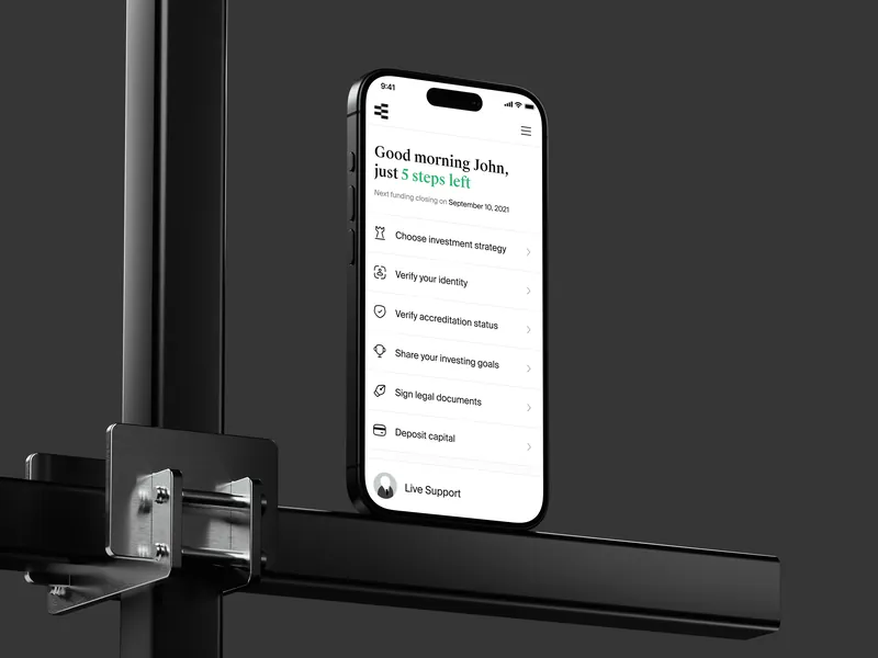
For products where people sign up and stall before they reach what made them sign up: a setup that asks too much, a verification step that loses half the users, an empty first screen. I find where they leave, redesign the path to the first useful moment, and design the regulated steps, like KYC and AML checks, so they cost as little as the rules allow. On Equi, onboarding time dropped by 40%.
To start, email andriy.dsgn@gmail.com with a link to the sign-up and a line about where people drop.
Where onboarding usually loses people
- A sign-up that asks for everything before showing anything.
- Verification steps with no explanation of why, how long, or what happens next.
- An empty first screen, with nothing to do and no example of what good looks like.
- All the complexity at once, instead of in the order people need it.
- No way back: one wrong answer in setup and the account is stuck.
What I design
- The shortest path to the first useful moment, and what can wait until after it.
- Regulated steps that explain themselves: what is asked, why, how long it takes, what happens if it fails.
- First-run and empty states that show what the product is for.
- Complexity revealed in the order people need it, with small patterns like tooltips and microcopy instead of a tour.
- Measurement: the events that show where people leave, so the next change is not a guess.
Where the experience comes from
| Product | What I designed | Measured |
|---|---|---|
| Equi | A digital family office from zero to MVP, including KYC and AML onboarding | Onboarding time dropped by 40% |
| Deva | Teaching flows for an AI agent product, complexity introduced in steps | In the beta, tasks took 30% less time in usability tests |
| TrueFi | Tooltips and microcopy to make lending, staking and farming approachable | No published measure of the design work |
Measured by the teams, not by me, and reported to me by the people who ran the numbers. Each compares with the version before the change: Deva’s in its beta, Equi’s while I was on the team, 2021-2022. My part in each is on the case page.
What it costs
Each onboarding flow is priced after a short audit. When people drop off, the audit is a Product Diagnosis, from $900: it walks the sign-up as it actually runs and reads your analytics to find where and why people leave. A Consistency Review, from $700, fits only when the onboarding screens no longer match the rest of the product. The fee for a Consistency Review or a Product Diagnosis is credited in full toward the work that follows, if it starts within 30 days. That work is quoted separately.
Questions teams ask
How much does onboarding design cost?
A price per flow, set after a short audit, so you know the total before work starts. If the scope changes, we agree the change first.
Can you design KYC and AML steps?
Yes. On Equi I designed the KYC and AML onboarding of a digital family office. The rules decide what you must ask; the design decides how much it costs the user to answer.
Do you need our analytics?
It helps. Where they are missing, the audit says which events to add before the redesign.
Do you work with teams in other countries?
Yes. I work remotely, with teams in different countries and time zones.
Other ways I can help
- SaaS UX redesign, quoted per flow: for products that are powerful and confusing.
- Mobile app design, quoted per flow: from the first flows to shipped screens.
- UX audit, from $700: three reviews, and what each checks.
Further reading: Equi: an investment app. All services, with the situation each one fits: Services.
Do people sign up and never arrive?
Send a link to the sign-up and a line about where they drop. If it’s not a fit, I’ll say so.