Equi: Zero-to-one design for a digital family office
Equi is the first digital family office designed to unlock access to top-performing alternative investments for institutions, advisors, and HNW individuals. Combining decades of Wall Street experience with Silicon Valley execution, Equi delivers a tech-driven multi-manager platform focused on absolute return strategies. My role at Equi was to shape the product from zero: laying down the UX foundation, creating a scalable design system, defining the brand language, and building user experiences that instilled confidence in a traditionally opaque industry. I was deeply involved in every step of product development, from research to release.
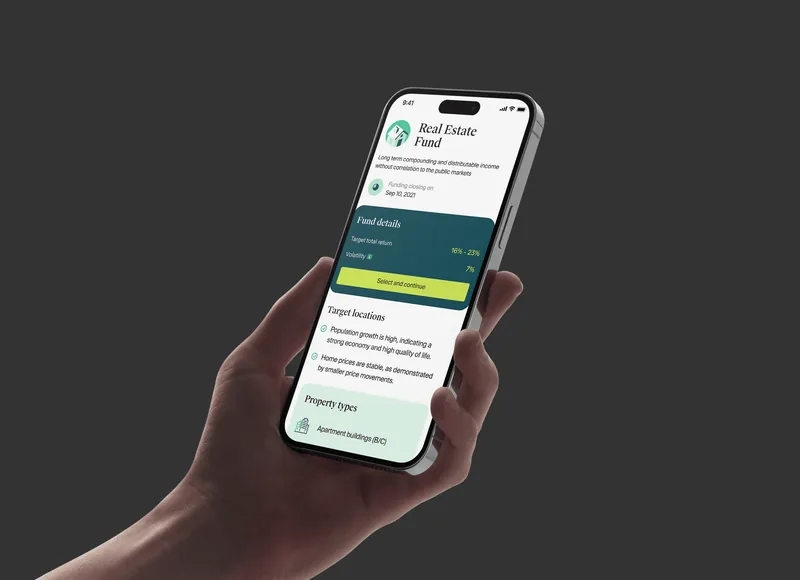
Alternative investing had always been dominated by legacy systems, fragmented onboarding, and opaque product access. Equi’s goal was to simplify this process and make complex financial strategies accessible, understandable, and engaging through a single digital platform.
Equi was also a new category: a fully digital family office with automated onboarding, accredited investor support, and diversified investment bundles. The challenge was to bridge technical complexity with user-centric design without sacrificing trust or regulatory compliance.
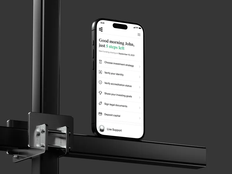
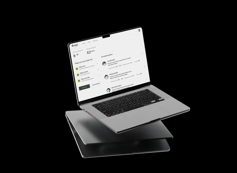
I was responsible for designing the entire UX architecture and core platform flows, tailored to the unique behaviors and needs of Equi’s investor personas. This included building structured pathways for fund discovery based on risk profiles, a progressive onboarding journey with accreditation (KYC/AML) checks, and seamless document and capital tracking. Each flow was modular, intuitive, and designed to guide users confidently through unfamiliar financial processes.
The result was a frictionless experience that translated complex investment tasks into clear, guided interactions, so investors could decide with confidence.
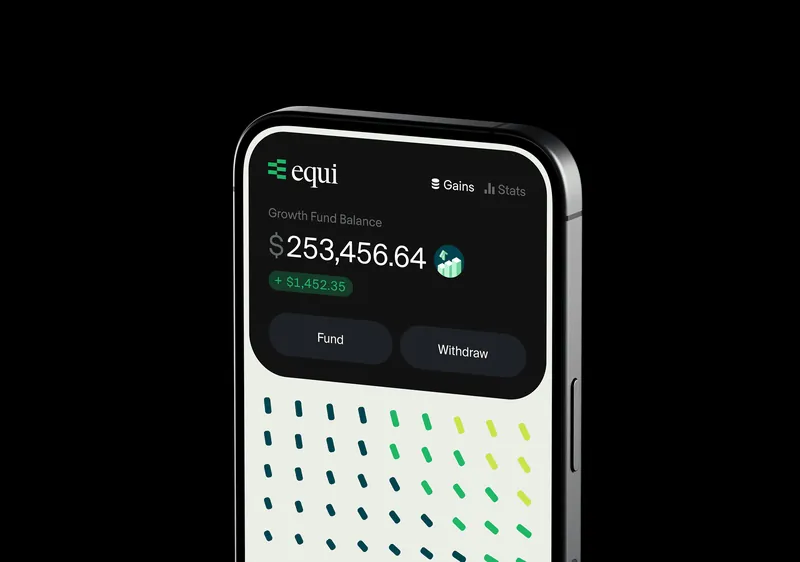

To foster trust in a traditionally opaque space, I designed a clean, minimal interface focused on clarity, precision, and professional calm. The product UI was built on an early-stage MVP identity, intentionally restrained in tone to prioritize usability, neutrality, and investor confidence during our initial rollout phase.
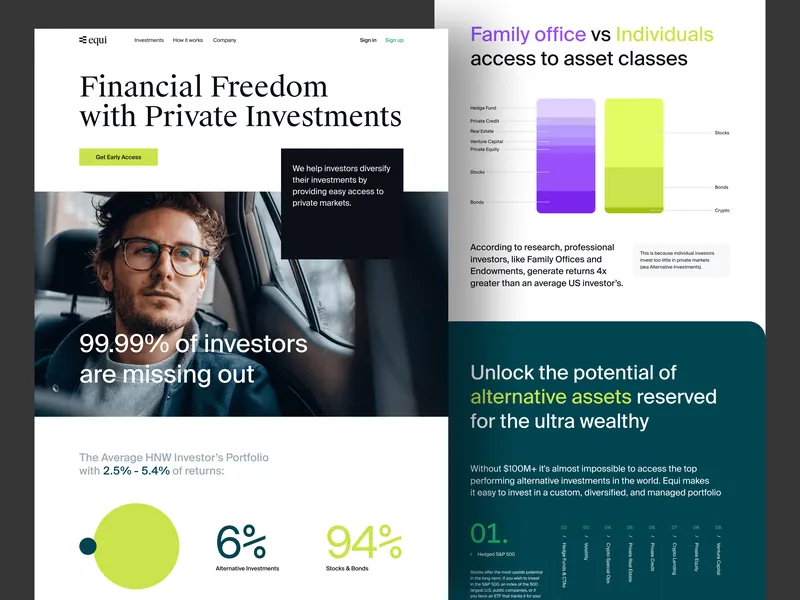
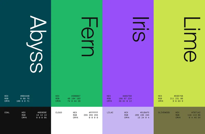
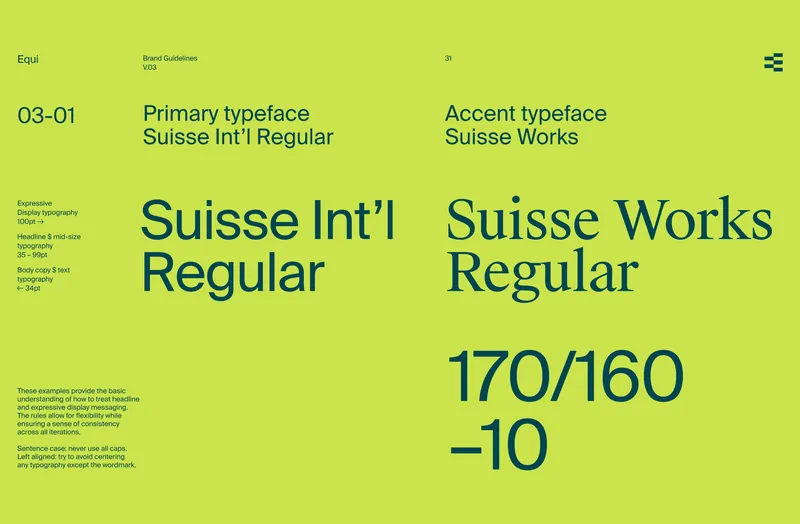
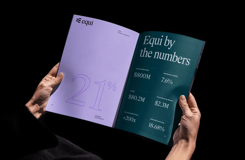
Toward the end of my involvement I refined and expanded the brand system to better align with the product experience, with consistent visual language, tone, and interface standards. This evolution elevated the overall presence of Equi across the platform and all investor-facing assets, reinforcing its core principle of operational excellence.

Results
The MVP launched, and onboarding time dropped by 40%. The company raised its Series A while I was on the team.
Working on something similar?
Equi was designed from zero to its MVP. Onboarding time dropped by 40%.