Redesigning a block explorer: A UX study of Voyager
In October 2024 I redesigned the block page of Voyager, Nethermind’s block explorer for Starknet, as a time-boxed design study. The page has two very different readers. A holder wants to know whether a transaction went through and what it cost. A developer debugging a contract wants gas, state and execution data without extra clicks. The redesign was not shipped and nothing in it was tested with users, so this write-up keeps apart what the original page showed, what I changed, and what would need evidence before anyone built it.
The page in October 2024
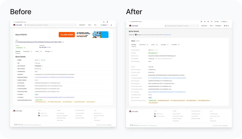
The screen I worked on was the block page; the screenshots use block 782,701. Status, hash and timestamp sat in the header next to a banner ad for a crypto game. Below them ran one column of fifteen fields, labeled in capitals and all given the same weight: number, age, Unix timestamp, time to create, confirmations, state root, sequencer address, Starknet version, gas and data gas prices in both ETH and STRK, L1 data availability mode, L1 transaction hash, and execution resources down to the count of each Cairo builtin.
For a developer that density is the reason to open the page. For a holder, the one thing they came for, whether the block was accepted, is a small badge in the header competing with the ad.
Two readers, the same fields
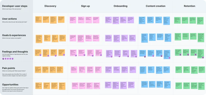
Before any screen I wrote two proto-personas: Sarah, a casual holder with moderate technical knowledge, and Alex, a developer who debugs contracts on Ethereum and Starknet. They are archetypes, and they disagree about the same fields. For Sarah, gas fees, state root and sequencer address are the jargon that makes the page hard to read; she wants to know whether her transaction went through and how much gas she paid. For Alex, sequencer address, state root and gas price are the data he came for, and he wants them without extra clicks.
No single order of fields serves both. Put the technical fields first and Sarah is lost. Hide them and Alex pays a click on every visit.
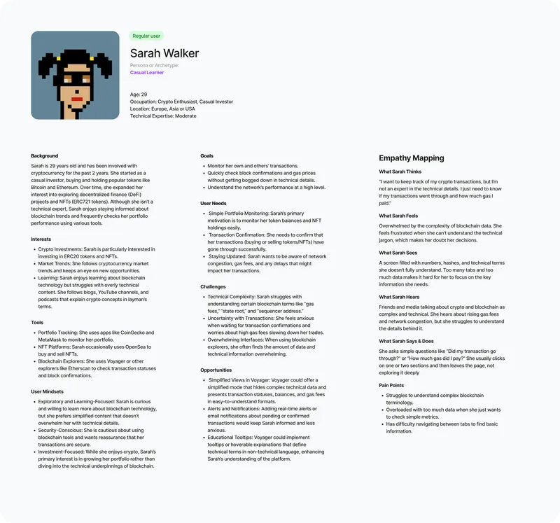
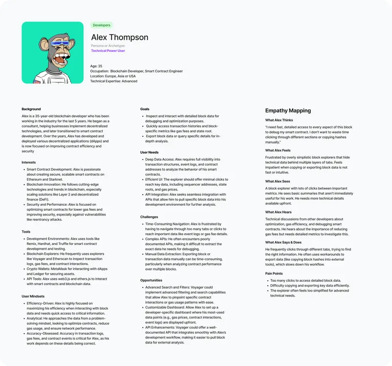
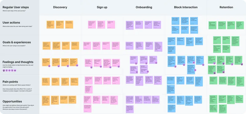
The journey maps follow both from discovery through sign-up and onboarding to reading a block and coming back. At the block page, the stage this study redesigned, Sarah’s pain points are too many tabs and too many unexplained terms. Alex’s are event logs and gas details behind tabs, and hashes copied into other tools by hand.
What the other explorers do
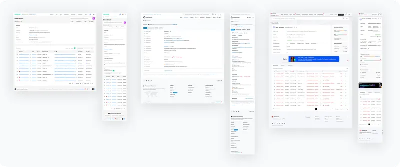
I compared the block pages of Etherscan, Solscan and Tronscan, on desktop and mobile. Solscan is the easiest to read and the thinnest for developers. Etherscan has the depth and keeps part of its fields behind a “Click to show more” link. Tronscan has strong developer tools behind navigation that casual users struggle with. None of them is designed for both readers on purpose.
Collapsing fields the way Etherscan does helps the casual reader and costs the developer a click on every visit, which is the complaint Alex’s persona starts from. A mode chosen once does not have that cost. That is the case for the Simple and Pro switch in the study: Simple keeps status and confirmations, Pro adds gas prices, execution resources and the state root.
What I changed, and what I kept
The changes are about order and weight:
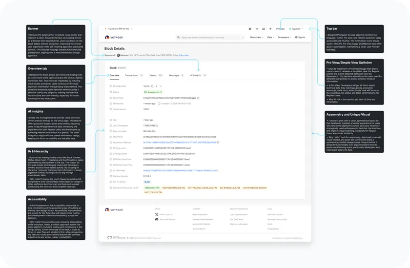
- Five fields first. Block number, status, hash, timestamp and confirmations form one group at the top. The technical fields follow after a gap.
- Readable labels. Captions lose their capitals, key values get a darker color, and the lines between rows go, which leaves more white space.
- The ad as one line. The banner leaves the header and becomes a line of text above the data, the format Etherscan uses on its own block pages. The sponsored slot stays and stops competing with the block.
- A switch in the top bar. Pro view sits next to language, theme and network, the other settings that apply to the whole site.
What stayed was deliberate. People arrive at Voyager already used to Etherscan and Solscan, so I left the structure alone and kept a symmetrical layout. An asymmetric one would have had more character, and it would have made developers hunt for data they already know where to find.
What the study left open
The switch is in the mockup, but the Simple and Pro views behind it were never designed. My note on the board gives the reason: “lack of time and information”. Designing them needs usage data this study did not have: which visitors open a block page, and which fields they read.
I also left out a full accessibility pass. Contrast and capitals were fixed on this page, but accessibility has to be solved in the design library and tested across the product, which a single page cannot do.
The AI Insights tab, added next to Overview, Transactions, Events and Messages, is a proposal: AI-generated analysis for people who do not want to read the raw fields. Nothing in the study shows whether either reader would use it.
What would need evidence
Because this was a study, these are the checks I would want before building it, not results.
- How long a casual visitor takes to find a block’s or a transaction’s status after opening the page.
- How many developers switch to Pro, and whether they stay there.
- Task completion for a developer looking up a contract’s recent events.
If developers rarely switch to Pro, either the switch is hard to find or Simple already covers them. Each answer leads to a different next iteration.
Get in touch
For crypto product work that shipped, see TrueFi, the DeFi lending protocol where I led design for three years. If your product serves experts and newcomers on the same screens, email me.