Landing page for an AI product: A concept for Artflow
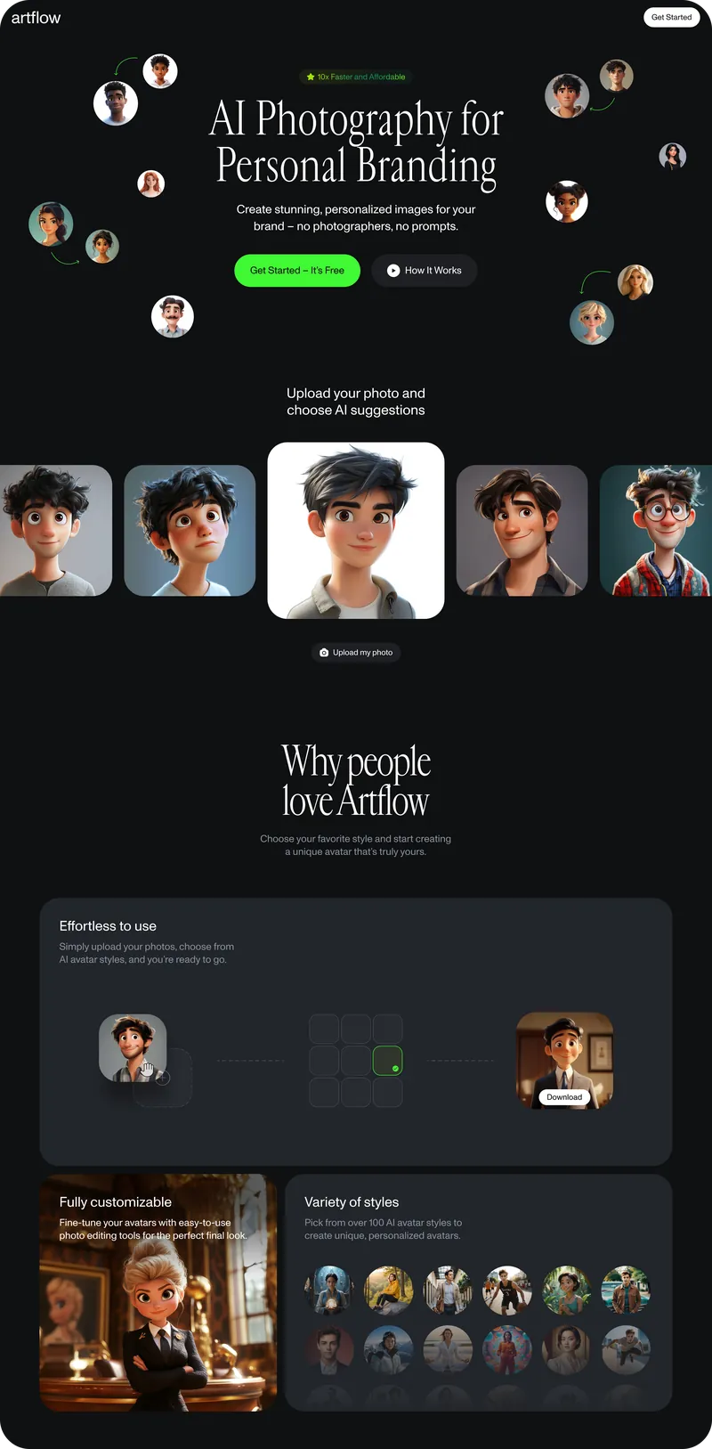
Artflow promises personal branding photos without a photographer and without prompts. The people it is for, consultants, doctors and freelancers, want the photos and none of the tooling. I designed this landing page as a concept. It was not launched, so there are no conversion numbers here. What it can show is the order of the decisions on the page, and how each one follows from who the visitor is.
The promise in their words
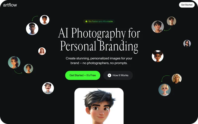
The headline names the product in the audience’s terms: “AI Photography for Personal Branding”. The subheading ends on the offer, “no photographers, no prompts”, which names the two things this audience would otherwise have to deal with. Nothing on the page explains how the images are made. Leaving the technology out was deliberate: no jargon anywhere, for people who came for a photo.
Proof before explanation
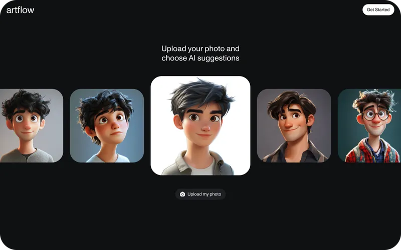
Generated avatars float around the hero in different styles before any feature is named. Directly under it, one face appears in five styles above an “Upload my photo” button, so a visitor sees what they would get before being asked for anything.
For this audience the examples carry more weight than feature copy. The question a skeptical visitor keeps to themselves is whether the result will look good on them, and only an example can answer it.
Actions that follow intent
A visitor who already believes the promise gets one obvious step: “Get started, it’s free”, the only green button on the page. A visitor who does not gets “How it works” beside it, darker so it never competes, and the examples further down. There is no pricing and no sign-up form on the page.
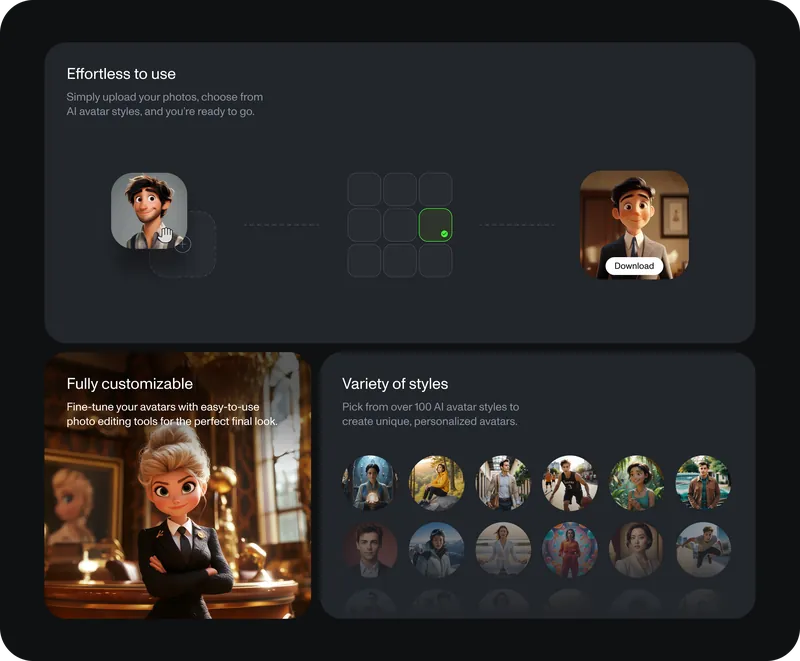
The process is shown as three steps, upload, choose and download, in one left-to-right graphic. Customization and the library of styles come after it, for people who want more control once the simple path is clear.
Type and color
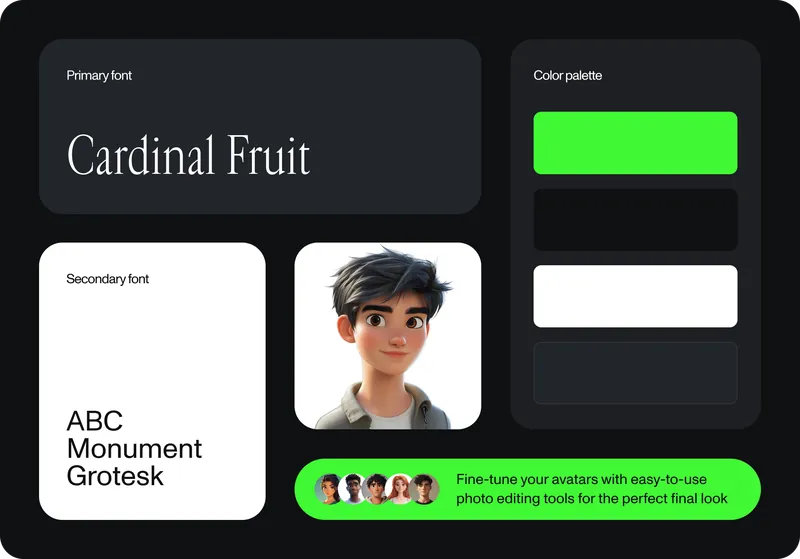
Cardinal Fruit, a serif, sets the headlines and gives the page a professional edge. ABC Monument Grotesk sets everything else. The base is black and deep grey so the photos carry the color, and one vibrant green is kept for actions.
What a launch would need to show
A concept shows the order of a page, not whether it works. These are the numbers that would say so:
- Clicks on the primary action from the hero, against clicks on “How it works”.
- The share of visitors who reach the upload step.
- Time from landing to the first generated image.
- Which style previews get clicked, as a signal for what to show first.
What the concept taught me
Designing for people who value the result over the tool meant cutting constantly. The hard part was resisting the urge to show every feature and trusting a few well-placed elements to carry the message.
Get in touch
The same problem, presenting AI to people who are not experts, ran through Deva, which I designed from zero, landing pages included. If you are launching an AI product to that audience, email me.